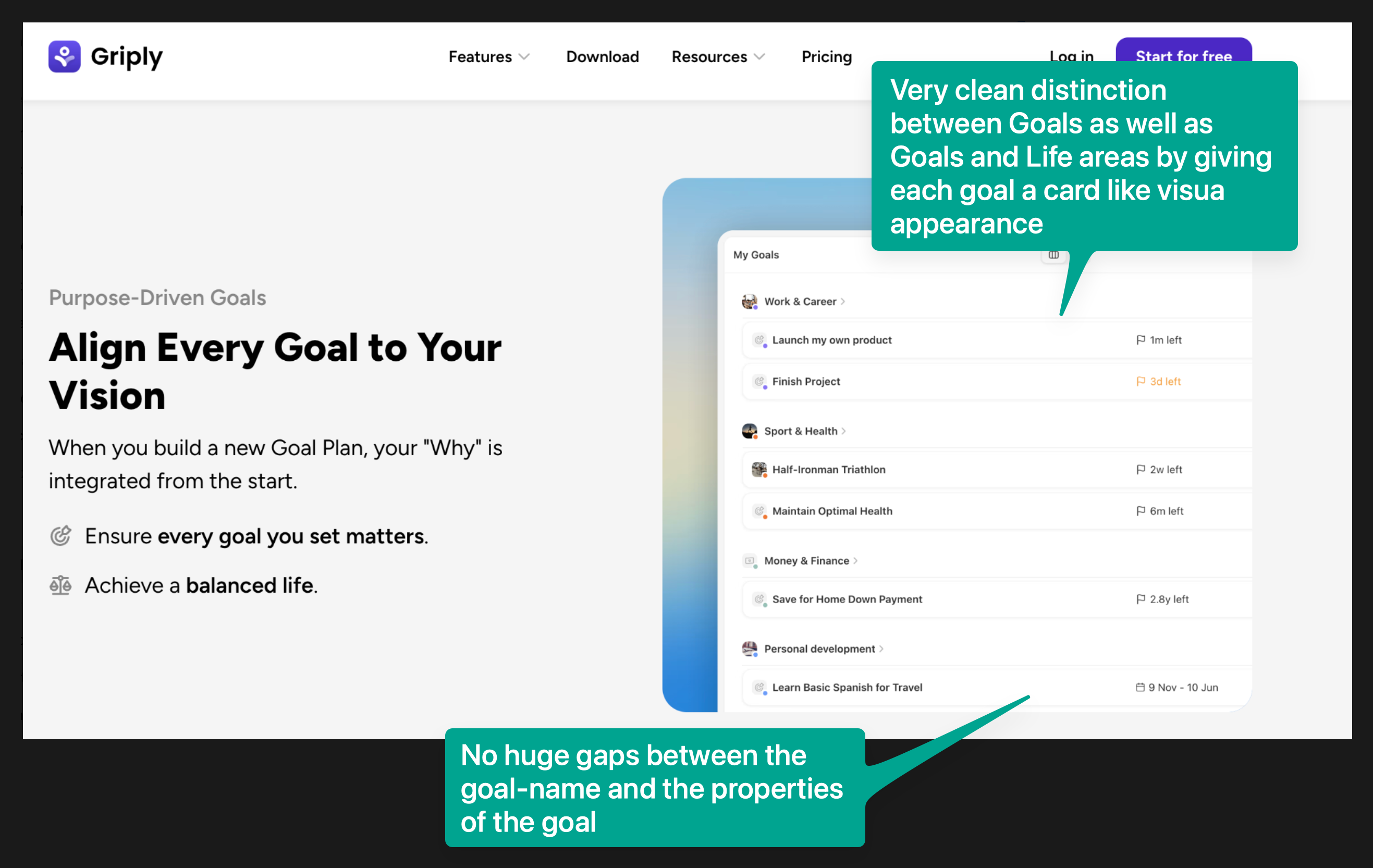
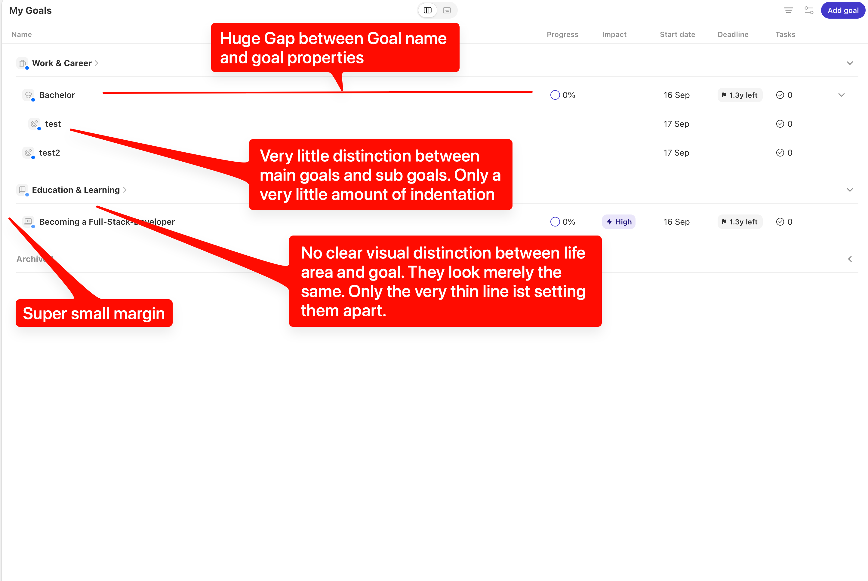
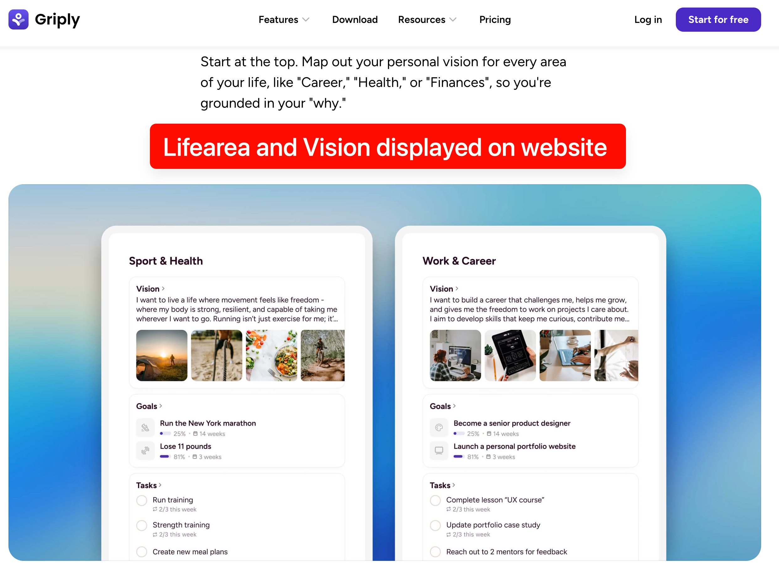
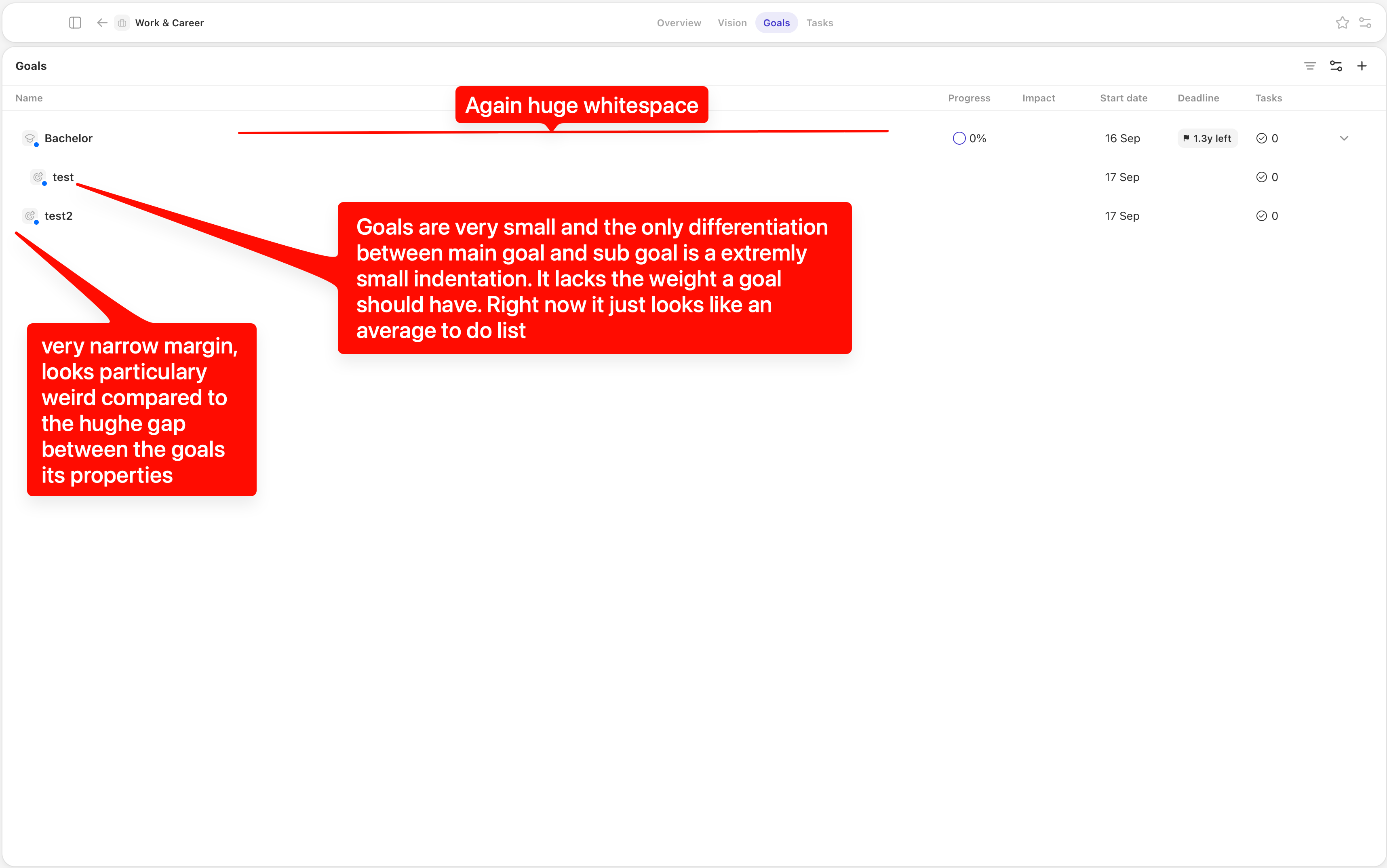
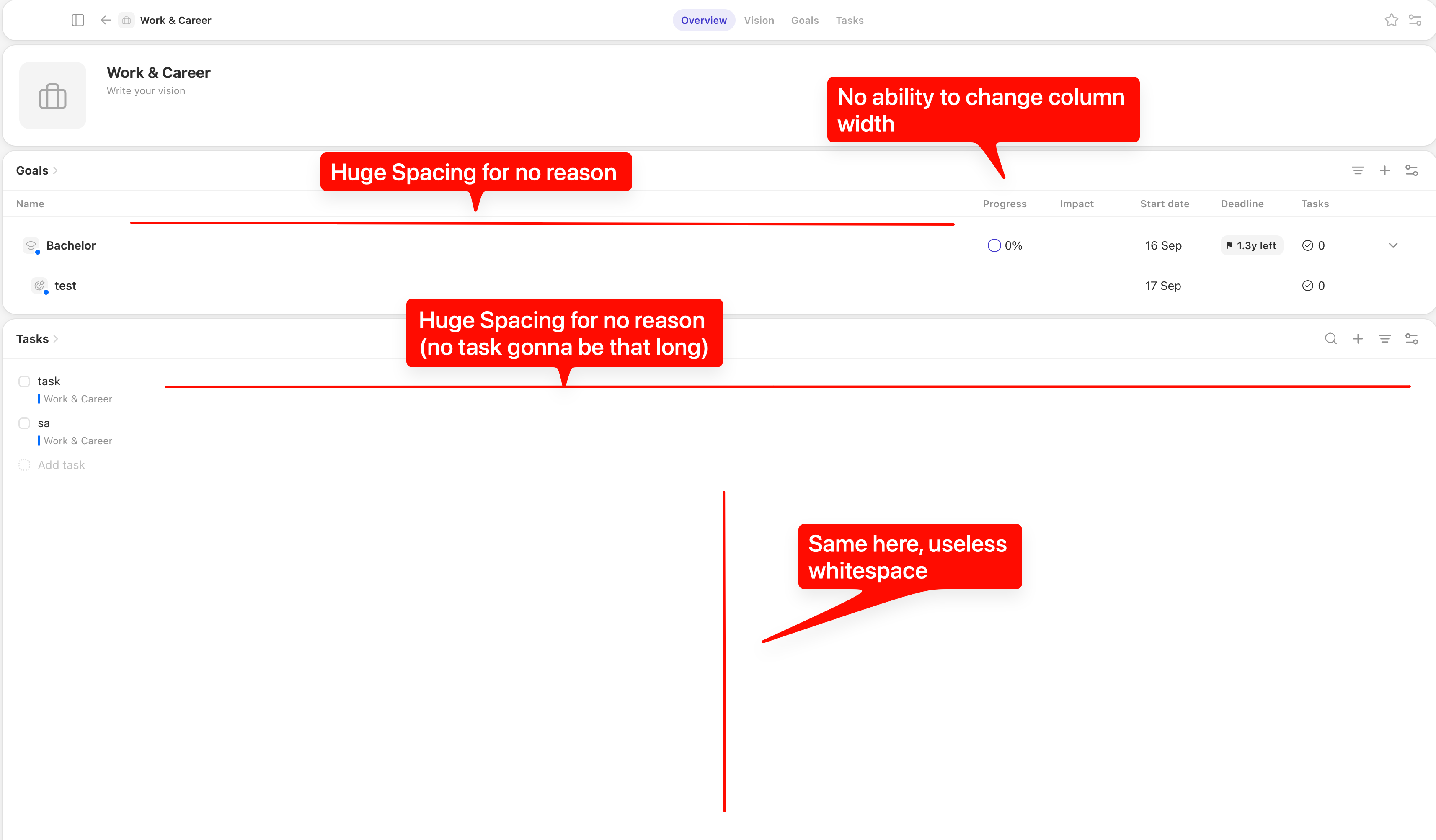
The current desktop app feels much flatter and more table-oriented than the UI shown on Griply's website.
On the website, Life Areas, Vision, Goals and Tasks are visually separated using cards, spacing, typography and clear hierarchy. This makes the interface feel much easier to scan and understand.
In the actual web app, many elements have very similar visual weight. Sections are extremely large while text and metadata are relatively small, and Life Areas, Goals and Tasks often look more like rows in a database than distinct levels of the hierarchy.
I would love to see the actual Griply interface move closer to the design language already shown on the website:
stronger visual hierarchy between Life Areas, Goals, Projects and Tasks
more card-based grouping where appropriate
better typography scaling
more balanced use of whitespace
clearer distinction between section headers and actual content
denser use of space on large desktop screens
The website mockups already show a really nice direction for this.