Compact tree view/Compacter design
TLDR: Griply’s design at the moment means more clicking, more scrolling, less efficiency and less overview.
Something that I am missing completely at the moment to get a quick overview, is a compact treeview with all dependencies.
Task view with grouping is a good start but it’s taking so much space.
Task info could be inline instead of adding a second line and the gaps between Goals/Projects and tasks could get reduced.
Subtasks are not shown at all in task view.
Something like:
Goal Info
∟-- Sub Goal/Project Info
∟---- Task Info
∟------ Subtask Info
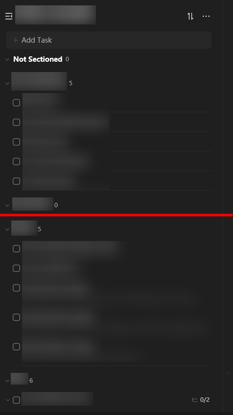
It becomes very apparent when comparing the same project in two different apps. Yes, Griply has another structure but I don’t really care if it’s called lists, folders, goals, projects, (sub-)tasks… what matters is dependencies. And when comparing those views, you see how much screen real estate Griply wastes in its design:
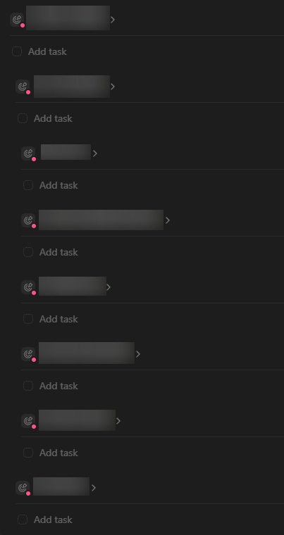
In comparison (the red line marks the end of what is shown in Griply, window sizes were the same):
Log in to comment and vote
No comments yet
Be the first to share your thoughts.