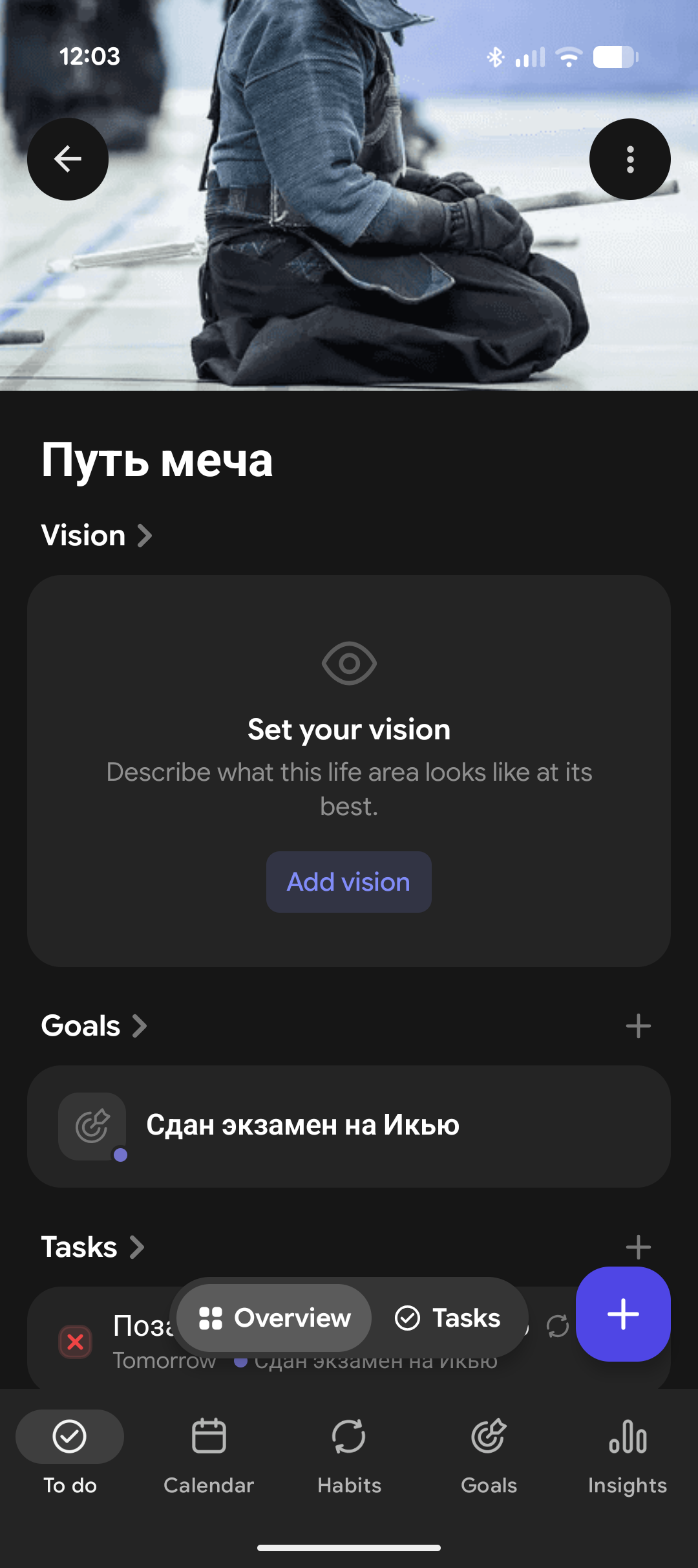
Right now, on all the apps, the images loaded to the life areas are clipped to a square. On the web and iOS apps they're shown as a square as well, but on the Android app, the clipped even more. So, as a user I need to choose if it looks nice on desktop or on Android (not both).
P.S. An easy fix would be just make the images height the same as width, but please don't remove this header background style of them. It's much nicer than a small square on the desktop app.